Selected class projects
Dreamscape · November 24, 2025
Tools & Techniques:
Layer masking, color grading, blending, object compositing, atmospheric effects, digital painting touches
Project Description
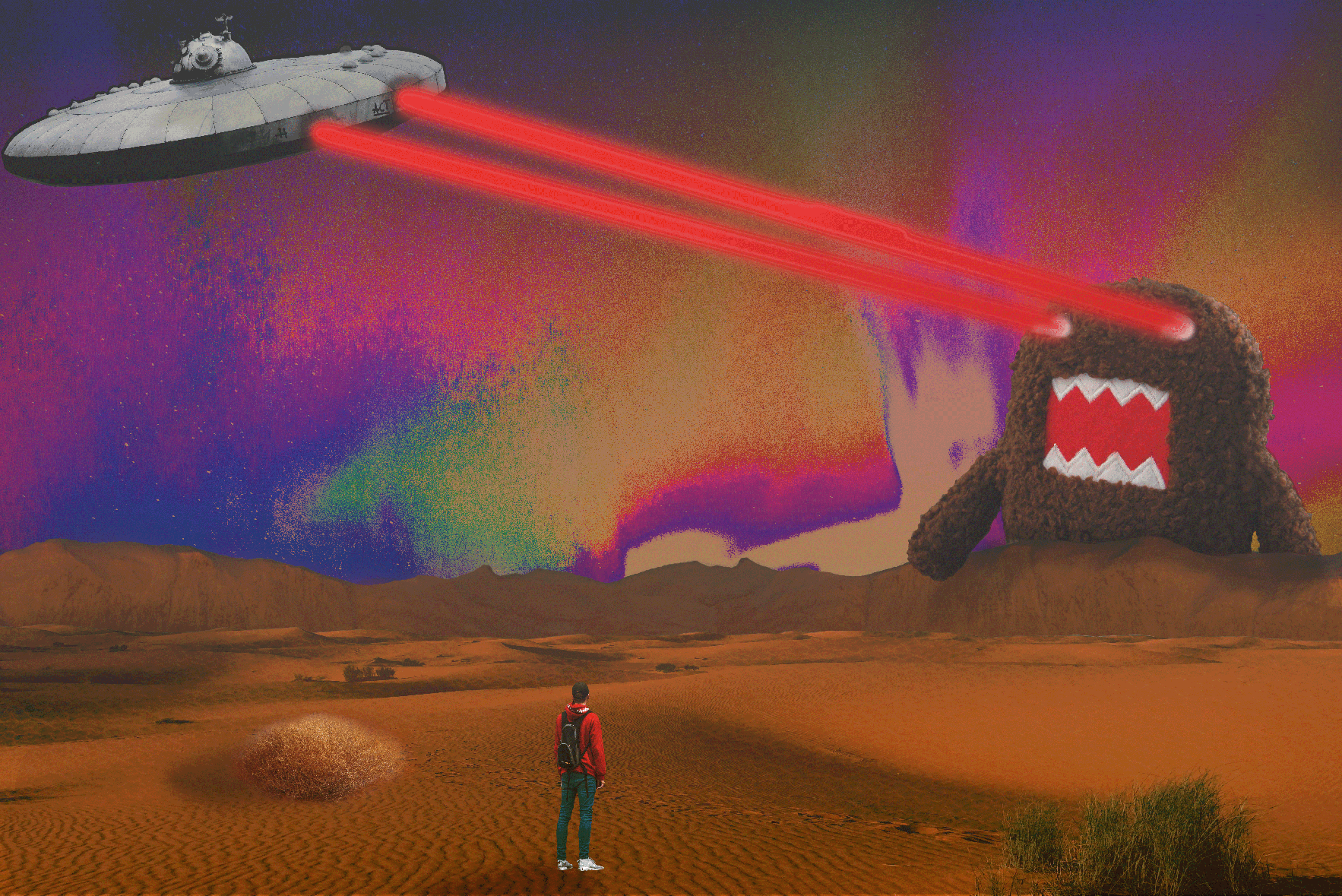
The goal of the Dreamscape assignment was to combine unrelated images into one surreal, believable world.
I created a dramatic desert environment where a lone figure watches a UFO fire lasers at a giant creature.
The focus was on contrast, surreal scale, and vibrant color to build a dreamlike narrative.
Learning & Achievements
This project changed how I approach Photoshop. I practiced lighting, shadows, and color grading to blend
multiple images into a single cohesive scene. I learned how atmosphere elevates realism—subtle textures
and gradients in the sky made the environment feel immersive. It was also one of the first projects where
I experimented freely with bold color choices. The purples and oranges were introduced through grading,
not the original images, helping unify the composition. Creating a visual narrative taught me how emotion
can be communicated without text. By the end, I realized I was no longer just editing images—I was building
a world.
Self-Reflection & Critique
Strengths: Bold color palette, strong atmosphere, clean compositing, creative surreal concept.
Areas for Improvement: Some shadows could be more consistent, and the creature edges could be softened further for realism.

Chain Alert Logo · September 15, 2025
Tools & Techniques:
Pen Tool, Shape Builder Tool, Pathfinder, Gradient Tool, stroke editing, clipping masks, typography editing, drop shadow
Project Description
This project focused on designing a clean, bold logo using vector tools.
I created a warning-style emblem featuring a chain-outlined shield paired with a stylized alert bell icon.
The goal was to emphasize security, protection, and real-time alerting through strong iconography.
Learning & Achievements
This assignment reinforced the importance of structure in logo design.
At the beginning of the semester, I already had some experience with Illustrator, especially the Pen Tool and Pathfinder,
but this project pushed me to refine how I merge and subtract vector paths to achieve smooth, balanced forms.
I also learned how critical visual hierarchy is in professional logo design.
The chain border, shield, and bell each needed a clear contrast so the message would be readable instantly.
This assignment helped me see how Illustrator can make extremely clean, scalable artwork when the tools are used correctly.
It was one of the first designs in class and it's still one of my favorites.
Self-Reflection & Critique
Strengths: Strong symmetry, clean vector lines, bold iconography.
Areas for Improvement: I could have experimented more with texture or subtle highlights to add personality.
Movie Poster · October 27, 2025
Tools & Techniques:
Pen Tool, Curvature Tool, Shape Builder Tool, Gradient Tool, Pathfinder, Custom Brushes, Clipping Masks, Type Tool
Project Description
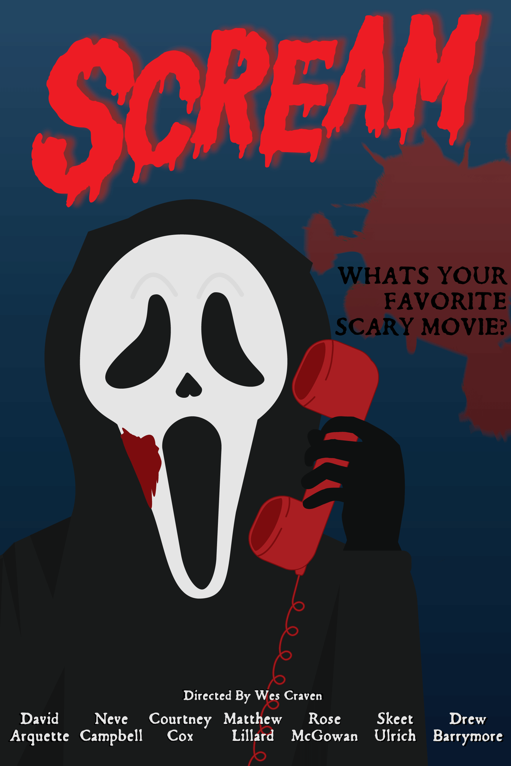
This assignment required designing a movie poster entirely in Illustrator using vector shapes, clean outlines, and simplified shading.
I recreated the iconic Ghostface character using flat colors and vector curves, and arranged all text and layout elements into a complete poster composition.
Learning & Achievements
Creating the SCREAM poster in Illustrator pushed me into a new level of vector illustration than I had experienced before.
Building Ghostface’s mask required precise Pen Tool curves and smooth anchor point control to keep the face recognizable without using gradients or heavy textures.
Another major achievement was figuring out the poster layout between balancing the character, the red phone, the text, and the credits at the bottom.
This project helped me grasp hierarchy, spacing, and how to lead the viewer’s eyes through an illustration.
After finishing this piece, I felt much more confident creating full, professional-style posters using only vector tools.
Self-Reflection & Critique
Strengths: Clean vector shapes, bold color contrast, strong recognizable illustration.
Areas for Improvement: Background could use more variation or subtle gradients for added depth.
Animal Mashup · November 5, 2025
Tools & Techniques:
Layer masks, color match, blending modes
Project Description
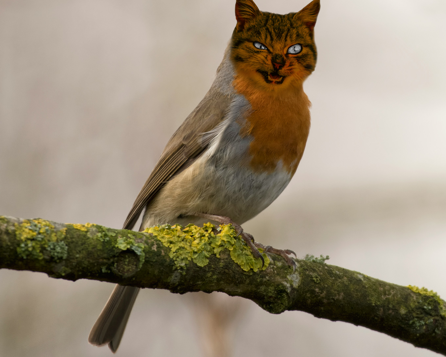
This project was a fun and surreal animal mashup assignment where I combined two different animals into one new creature.
I used a bird as the base and blended a cat’s face onto it.
The goal was to make it look weird but still somewhat believable by matching lighting, color, and texture.
Learning & Achievements
This assignment helped me understand how important blending is when combining different animals.
The hardest part was making the cat’s fur blend into the bird’s feathers without looking too obvious.
Layer Masks helped me hide and reveal parts of each animal slowly until they fit together.
I also practiced color matching so the cat’s face didn’t look out of place.
Even though it was meant to look surreal, I still had to think about shadows and edges so the mashup didn’t look messy.
This project helped me get more confident with Photoshop tools that make realistic edits.
Self-Reflection & Critique
Strengths: Funny and eye-catching, smooth blending.
Areas for Improvement: Could use more texture blending around the edges.
Double Exposure · November 3, 2025
Tools & Techniques:
Layer Masks, Blending Modes, Gradient Maps, Hue/Saturation Adjustments, Selective Color, Overlay Textures, Opacity Control, Layer Stacking, Color Balance
Project Description
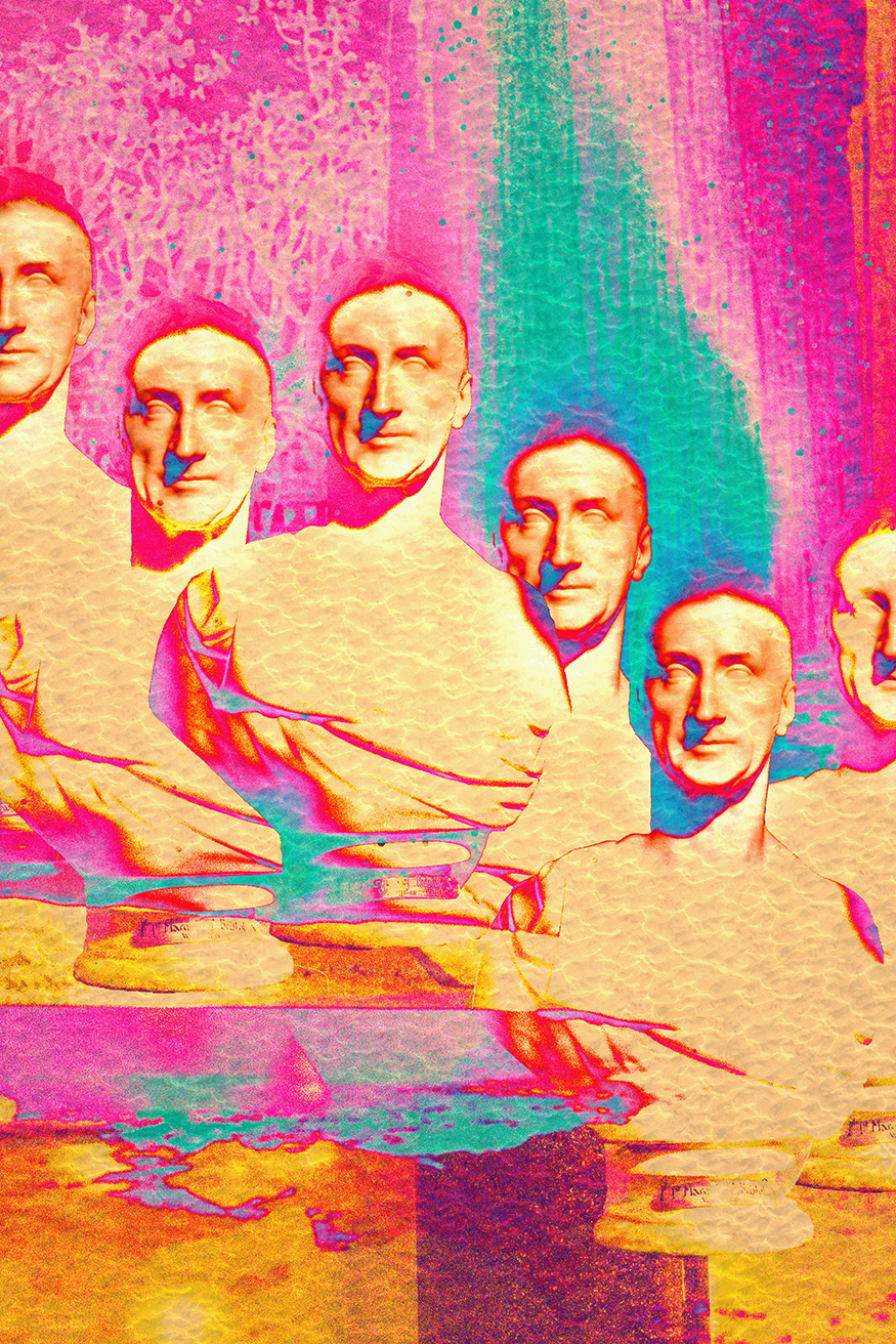
This assignment was focused on creating a surrealist-inspired digital artwork by blending multiple images into one imaginative, dreamlike composition.
The goal was to practice double-exposure techniques while also exploring surrealism, distorting reality, mixing unexpected visuals, and using expressive color.
Learning & Achievements
This project helped me understand surrealism in a more hands-on way.
Instead of focusing on making something realistic, I learned how to blend images in a way that feels unique and expressive.
Layer Masks were one of the most important tools because they let me fade images into each other smoothly.
I also experimented a lot with Blending Modes, which changed how each layer reacted and helped create cool effects that I wouldn’t have been able to plan ahead of time.
Self-Reflection & Critique
Strengths: Strong surrealist look, bold colors, interesting layering, eye-catching textures.
Areas for Improvement: A few areas feel a bit crowded and could use clearer focal points.

Magazine Cover · December 9, 2025
Tools & Techniques:
Layer masking,Color grading, typography, Digital painting touches
Project Description
This assignment focused on magazine layout and visual hierarchy that was parody or satire. The goal was to create a realistic magazine cover with a clear title, subheadings, barcode, and a central subject. I chose a humorous concept a royal toad wearing a crown because it let me mix photography with graphic design and lean into a playful fairytale theme.
Learning & Achievements
Working on this magazine cover taught me how important layout really is in graphic design. At the beginning of the semester, typography felt intimidating because tiny adjustments like tracking or leading didn’t seem like they mattered. But with this project, I started understanding how type actually guides the viewer’s eye. I learned how to arrange text so that the most important information stands out without overwhelming the cover. Layering the toad in Photoshop helped me practice masking and refining edges, and I also learned how to keep an image looking realistic while still adding surreal elements like the gold crown. Combining Illustrator and Photoshop in one final piece made me realize how flexible digital art can be. This project boosted my confidence because I finally felt like I could make something that looked like it belonged on a real magazine rack.
Self-Reflection & Critique
Strengths: Strong visual hierarchy, playful concept, clean cutout, and professional-looking type layout.
Areas for Improvement: Some spacing between text sections could be improved.